I have always been drawn to moody, cozy spaces filled with warm wood tones, deep greens, and aged paper hues.
That is exactly what the dark academia color palette brings to life. These colors carry vintage charm, quiet intellect, and a warm, brooding feeling.
This article covers hand-picked palettes with hex codes you can use right away. I will show you how to apply them in fashion, interiors, and art projects.
You will also get simple mixing tips to make any palette work for your style. No guesswork. Just clear, creative ideas ready to use.
Why Dark Academia Color Palettes Matter
Color sets the mood before anything else.
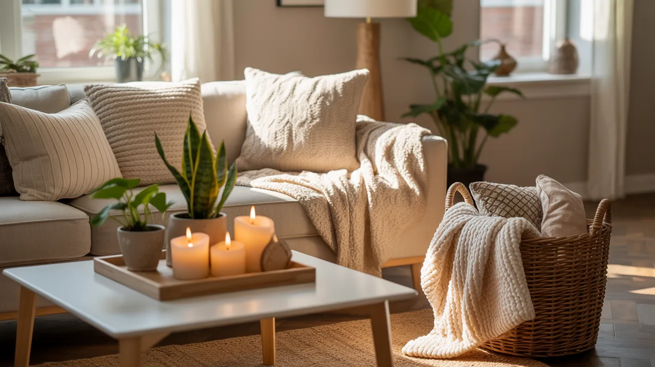
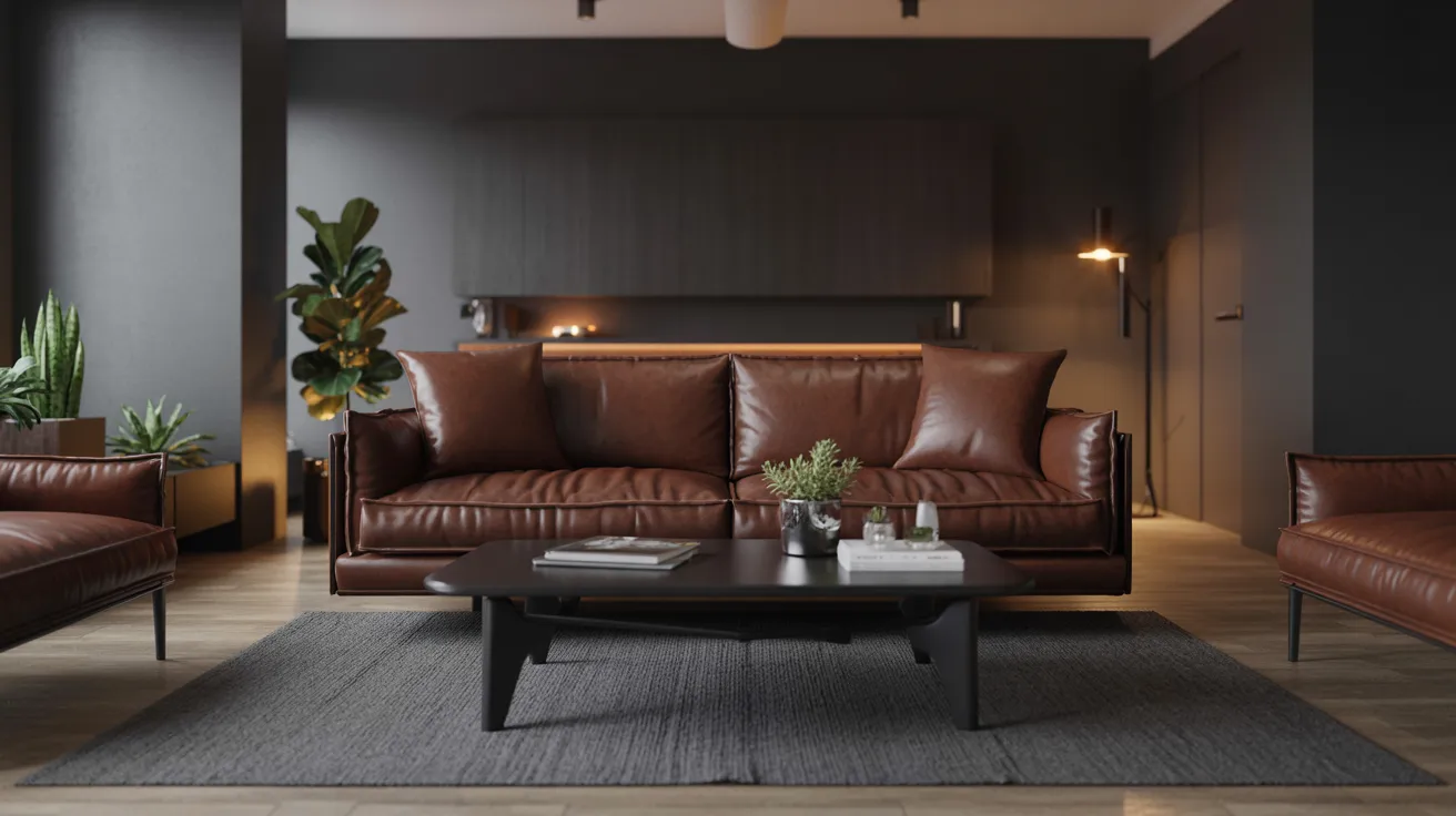
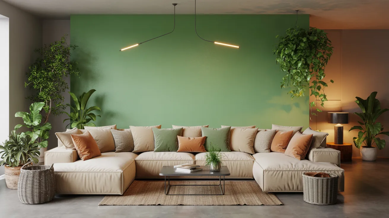
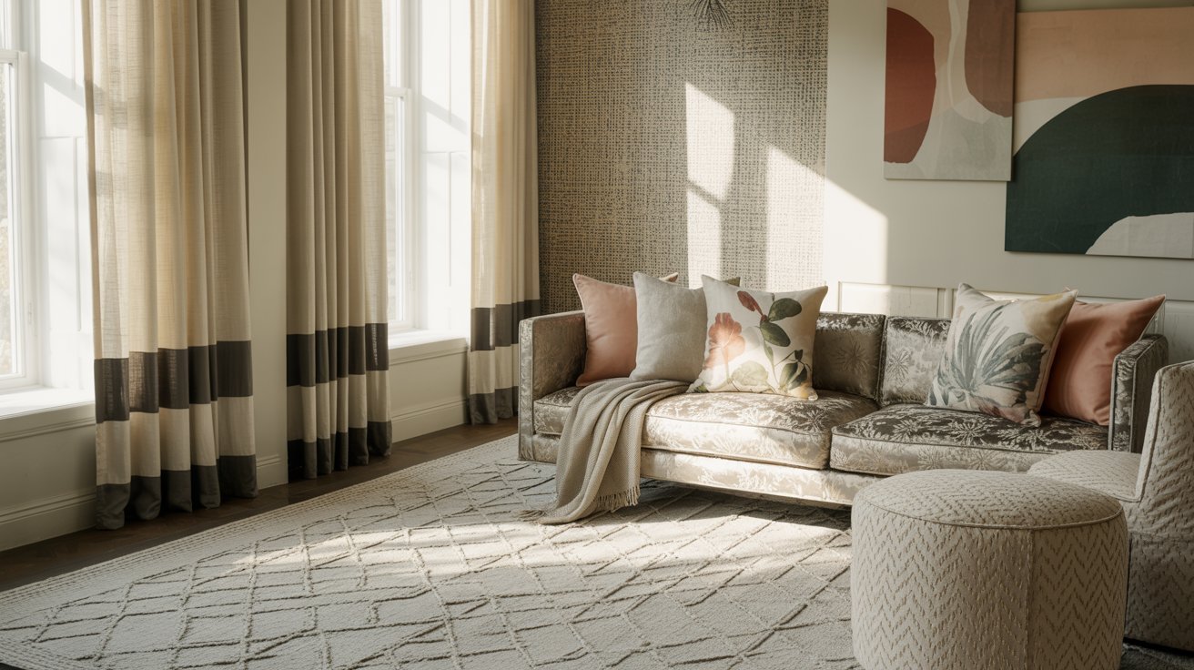
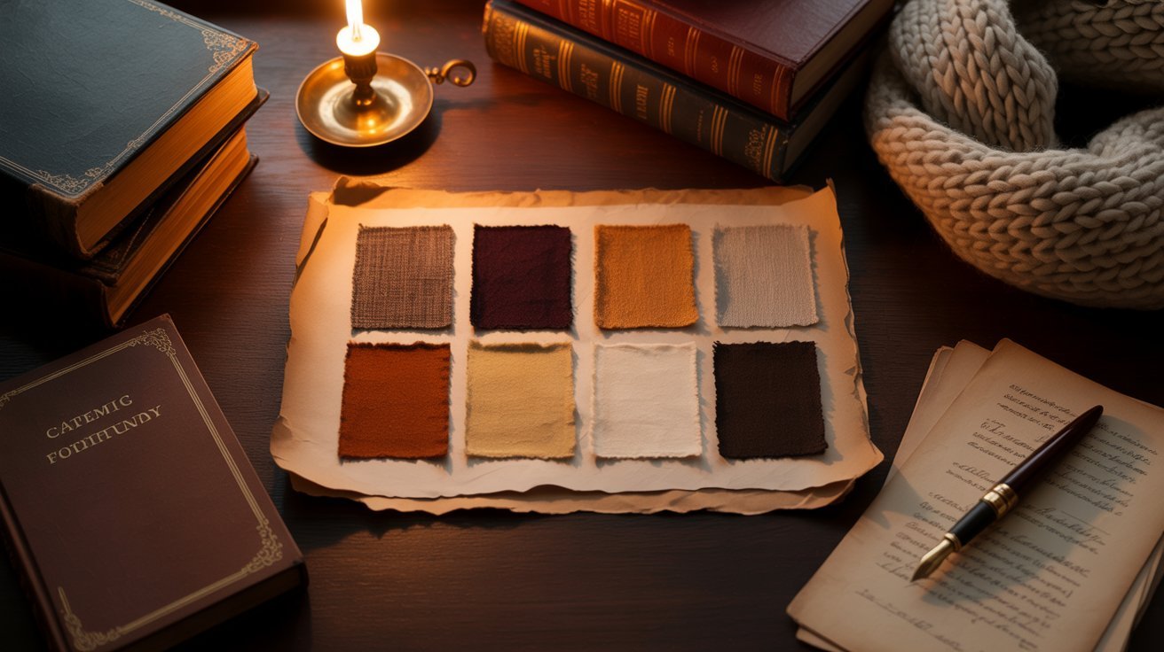
The dark academia palette pulls from deep, moody tones like burgundy, forest green, warm brown, and charcoal. Together, they create a feeling of history, warmth, and quiet focus.
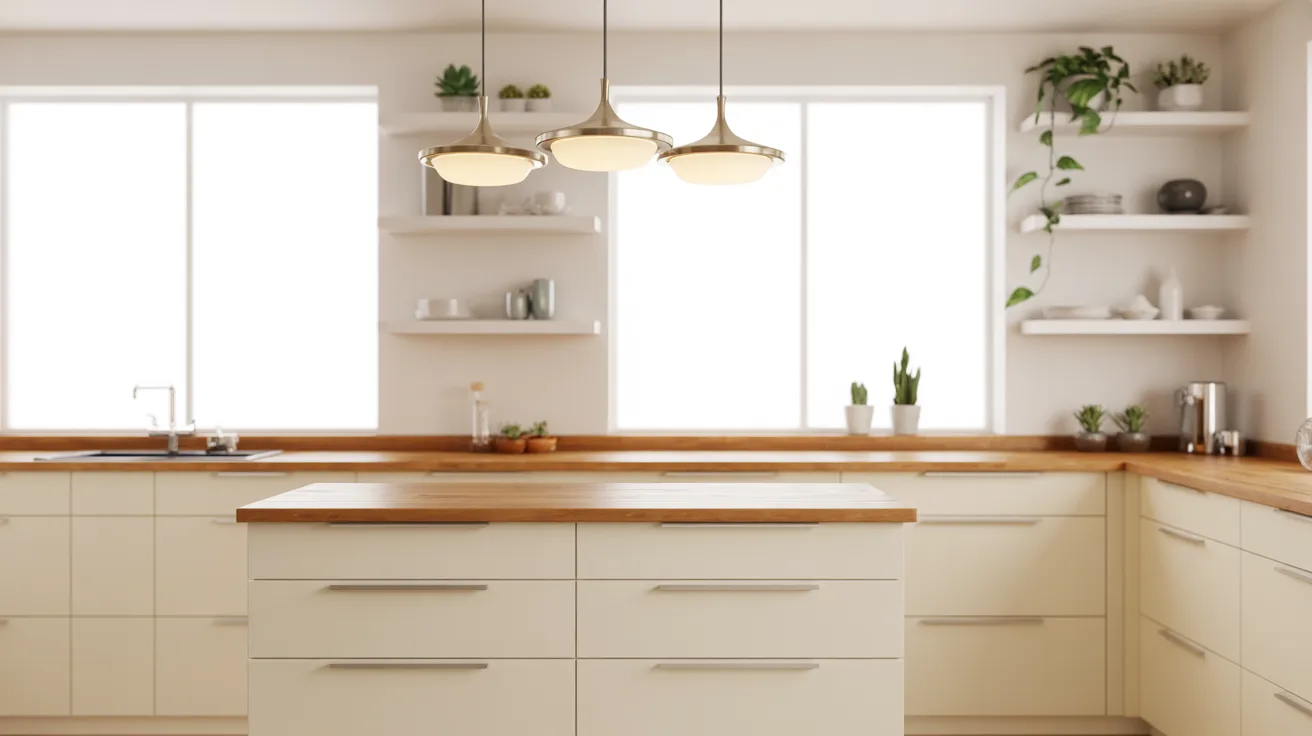
In a room, it feels cozy and literary. In fashion, it reads classic and bookish. In digital work, it adds depth and grounding.
It also has variations. Go warmer with coffee tones, cooler with slate blues, or richer with antique gold. Sherwin-Williams and Benjamin Moore even carry matching paint shades like “Aged Leather” or “Forest Moss.”
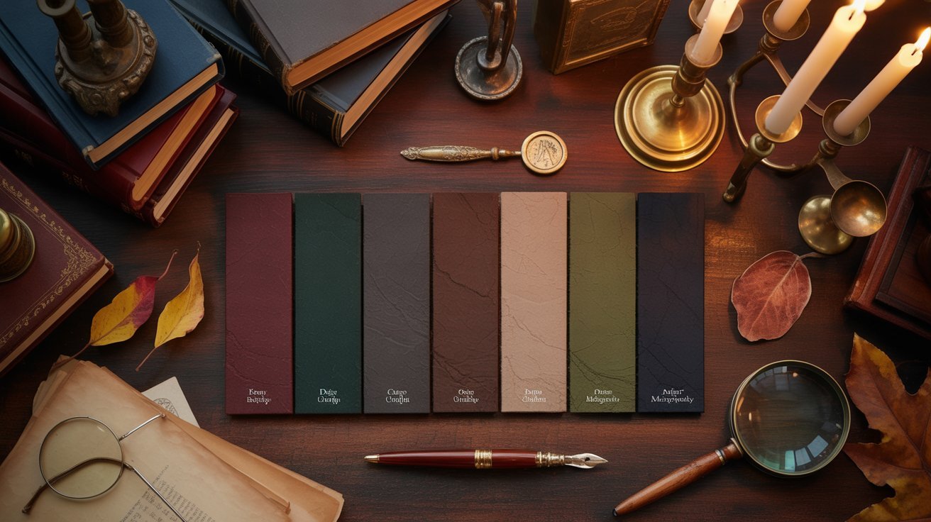
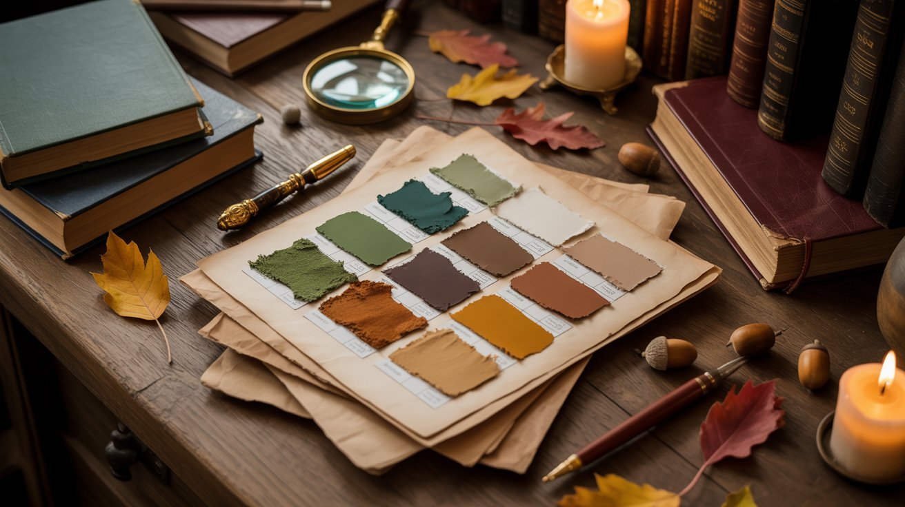
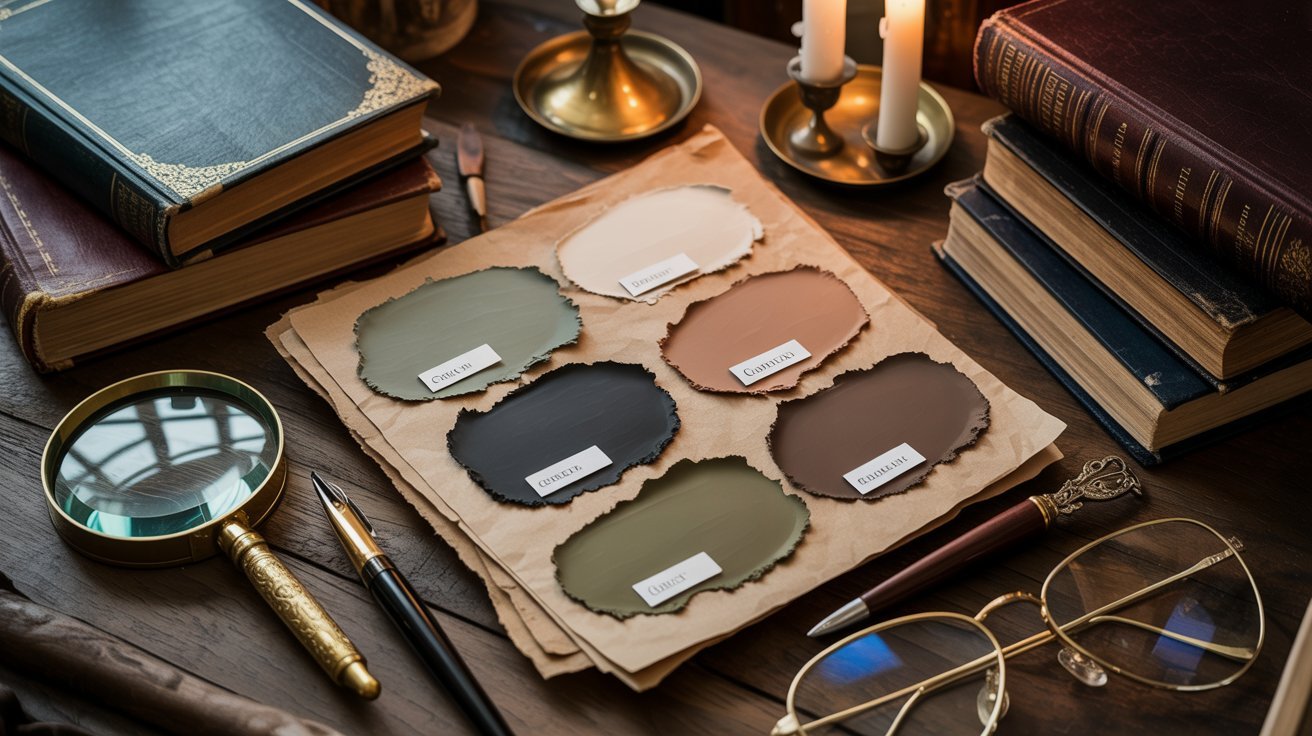
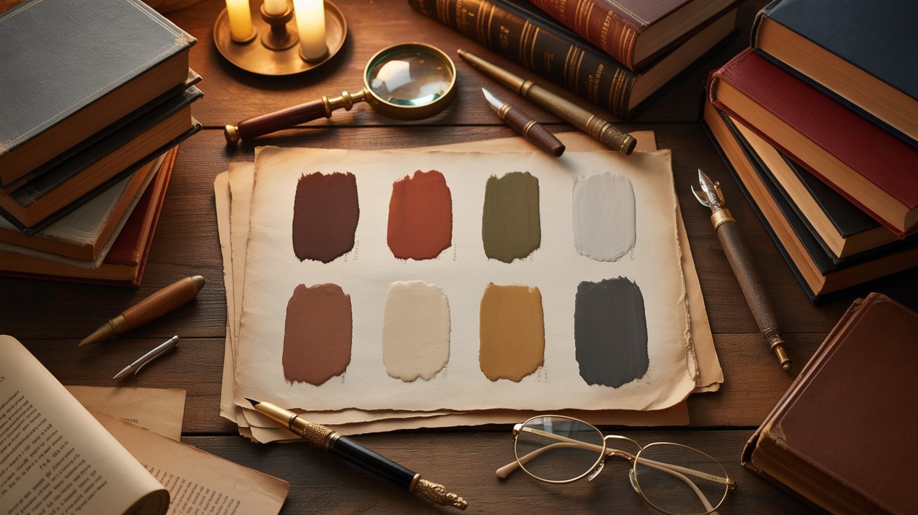
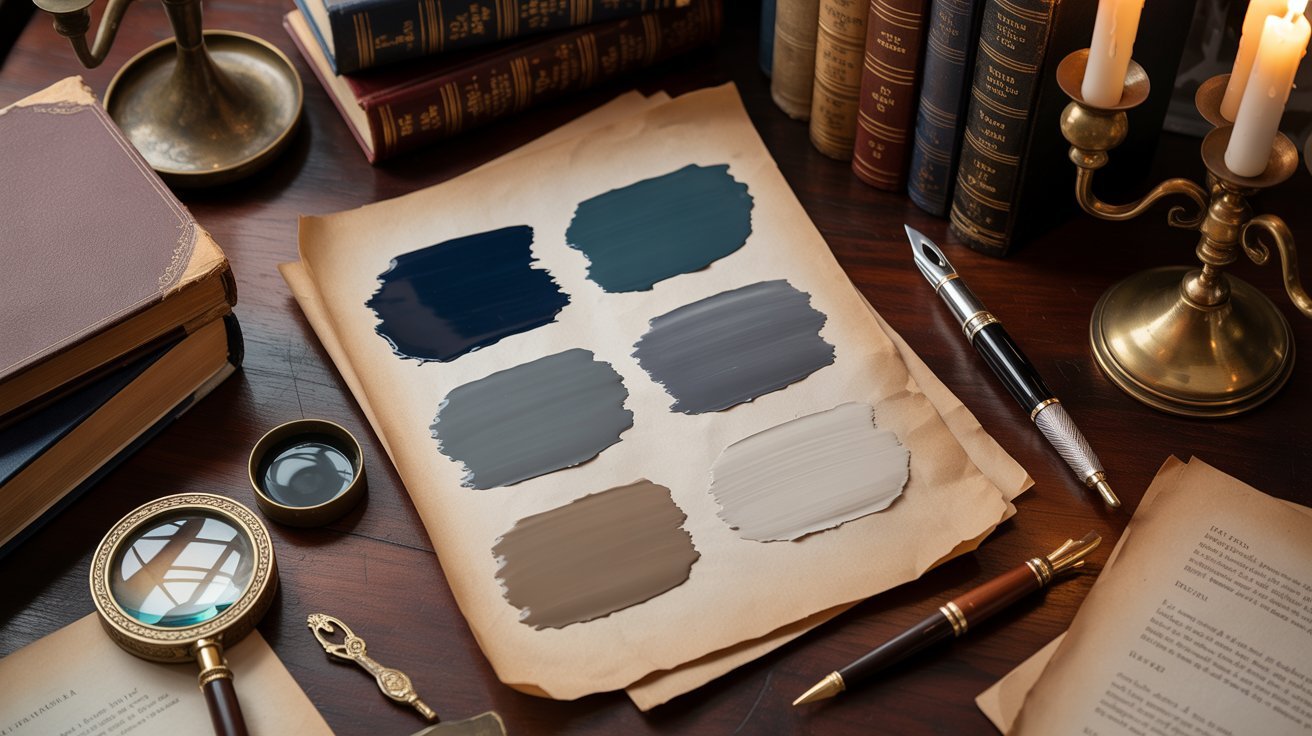
Top 21 Dark Academia Color Palettes for Idea
Each palette below comes with hex codes you can copy directly for design, art, or digital use.
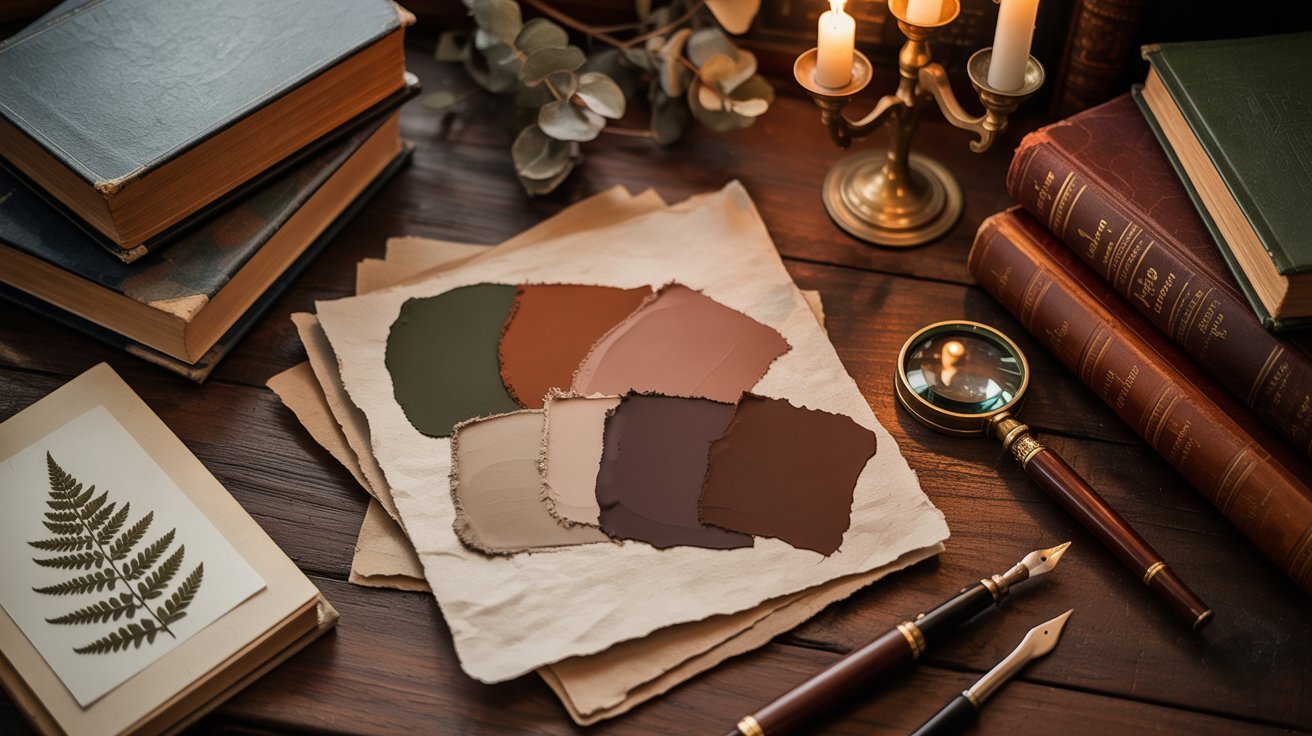
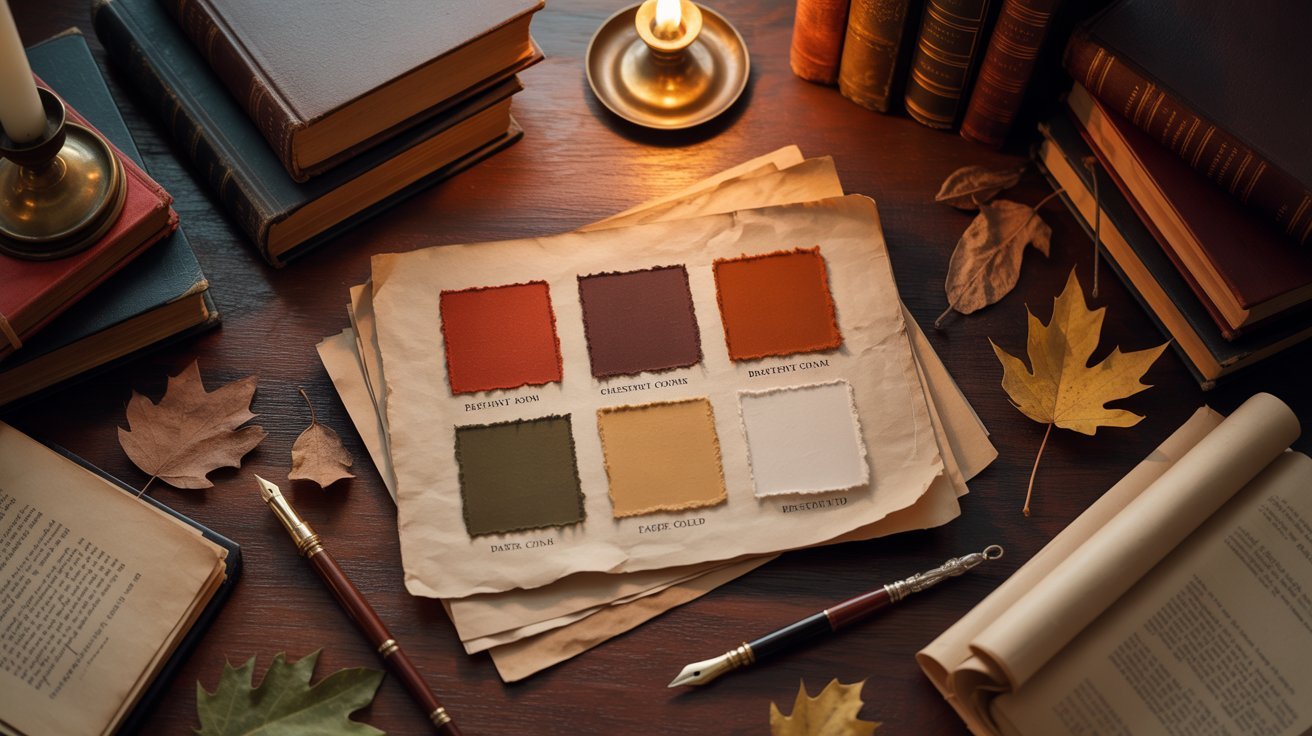
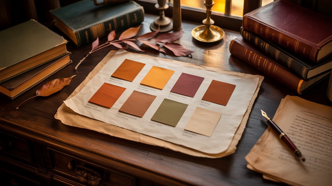
1. Burgundy & Earth Tones Palette
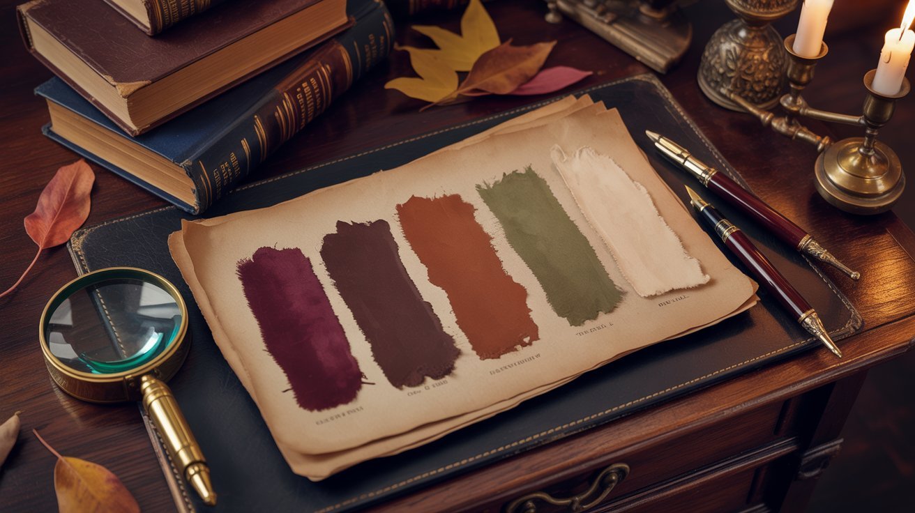
Warm, scholarly shades drawn from rich burgundy, dusty rose, and deep chocolate.
This palette feels warm and grounded. It works well for book covers, room decor, and cozy fashion looks. The deep reds and browns carry a strong autumn energy that is hard to go wrong with.
Hex Codes: #8C1127, #A68E80, #A65437, #592418, #26130F
2. Forest Harvest Palette
Lush greens meet golden amber in this natural, earthy mix.
This palette blends deep forest green with warm amber and burnt orange. It is perfect for nature-themed interiors or earthy fashion palettes. The contrast between green and gold keeps things visually interesting.
Hex Codes: #385248, #F29849, #F27C38, #732D14, #0D0D0D
3. Rustic Autumn Palette
Earthy olive and cinnamon tones with a grounded, seasonal feel.
These shades work well for autumn art projects, cozy room accents, or clothing layering. The olive green and golden tones together feel warm and classic without going too bold.
Hex Codes: #385928, #F2C063, #BF7C41, #8C512E, #26120B
4. Rustic Charm Palette
Mocha, taupe, and sienna tones that feel soft and lived-in.
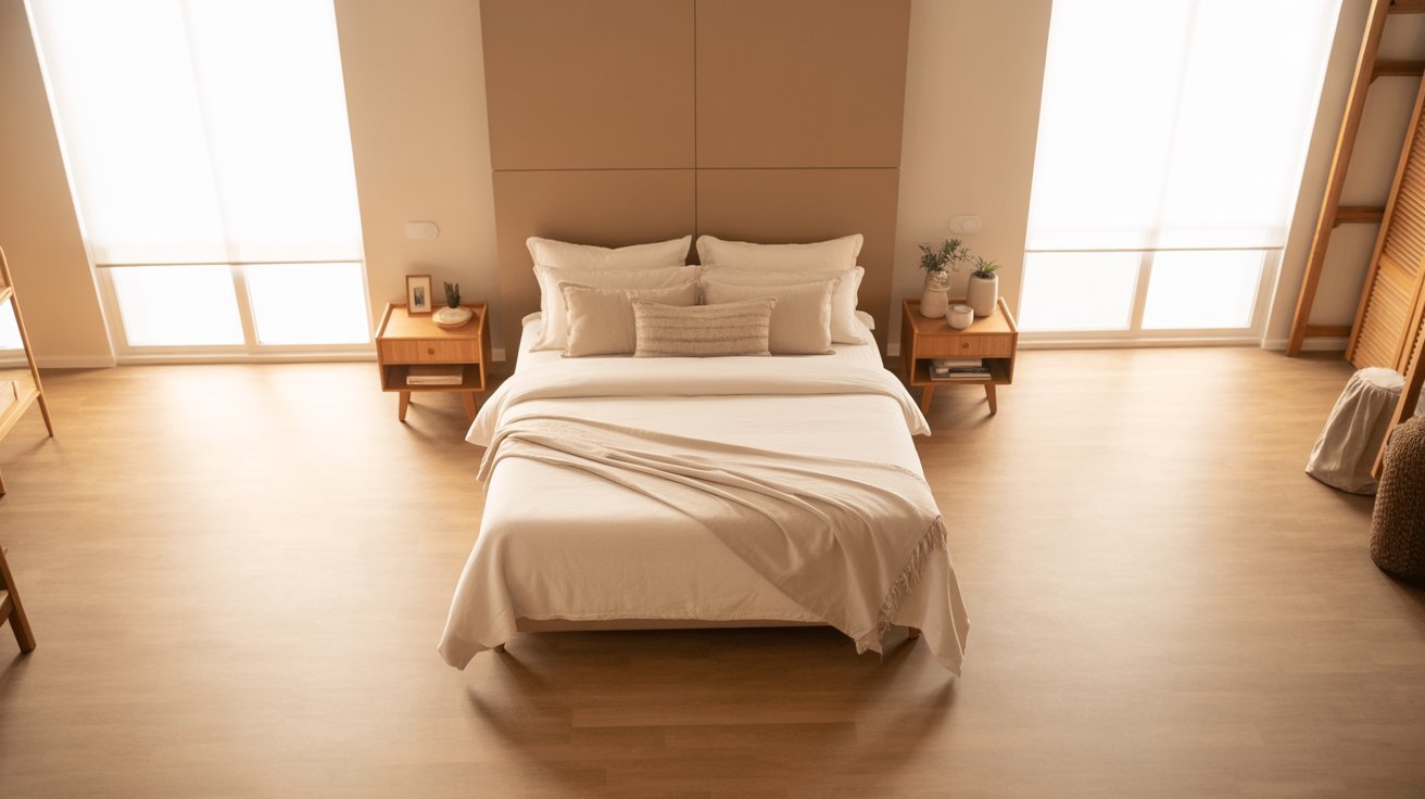
This palette has a very cozy feel. Use it for bedroom interiors, fashion neutrals, or backgrounds in graphic design work. The warm brown tones layer together in a very natural way.
Hex Codes: #261C0F, #A6886D, #BF7245, #A6360D, #731B07
5. Rainy Day Coziness Palette
Warm apricot and terracotta tones that are perfect for quiet, cloudy moods.
This one leans softer than most dark academia options. The lighter apricot tones make it good for interiors that need warmth without going too dark or heavy.
Hex Codes: #F2B872, #A65C32, #F28B50, #73351F, #400D0D
6. Earthy Retreat Palette
Forest green, mocha, and terracotta in a grounded, natural mix.
These three tones work well together in any setting. The green grounds the palette while mocha and terracotta add warmth and depth across the board.
Hex Codes: #142624, #A6783F, #8C7968, #592C1C, #8C4B45
7. Cloaked in Shadow Palette
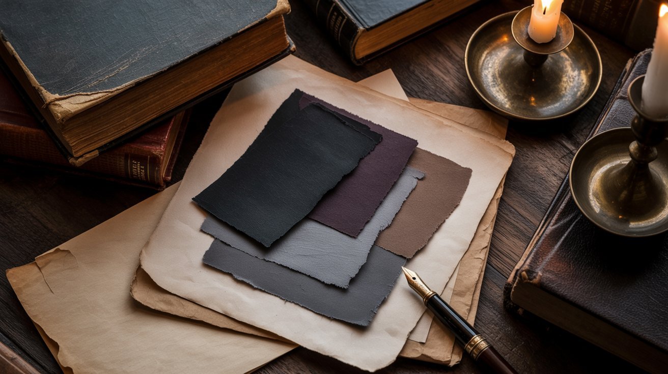
Dark, mysterious tones with a rich and moody feel throughout.
This palette is one of the darkest in the list. It works best for dramatic fashion choices, moody art, or accent walls in a study or reading room.
Hex Codes: #202621, #D9B596, #734838, #A66F5B, #401B1B
8. Timeless Depth Palette
Classic dark academia tones with deep midnight, charcoal, and warm leather.
This palette pairs deep navy with warm leather brown and slate blue. It feels rich, calm, and very classic. Great for home offices or editorial fashion styling.
Hex Codes: #03060D, #2D4D59, #6593A6, #402718, #A69574
9. Antique Manor Palette
Manor-style shades with warm rust, deep red, and aged linen tones.
The mix of light linen and deep red gives this palette a very vintage feel. Think old estate homes, aged leather chairs, and dusty bookshelves filled with old titles.
Hex Codes: #BFBDB0, #A69485, #BF4F26, #40261D, #73130A
10. Rustic Hearth Palette
Cozy crimson, moss, and amber tones with a fireplace energy.
This palette brings warmth and depth together in a natural way. The deep crimson and soft sage green complement each other well in interiors and art alike.
Hex Codes: #401C26, #525947, #828C72, #0D0D0A, #59230F
11. Tranquil Woodland Palette
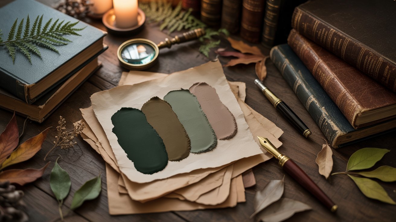
Serene woodland greens and warm browns for calm, grounded moods.
This palette is ideal for spaces where you want to feel settled and at ease. The sage and earthy brown make a very natural pairing for any setting.
Hex Codes: #242625, #363D34, #9FB5AC, #B38B58, #8AA58D
12. Rustic Vineyard Palette
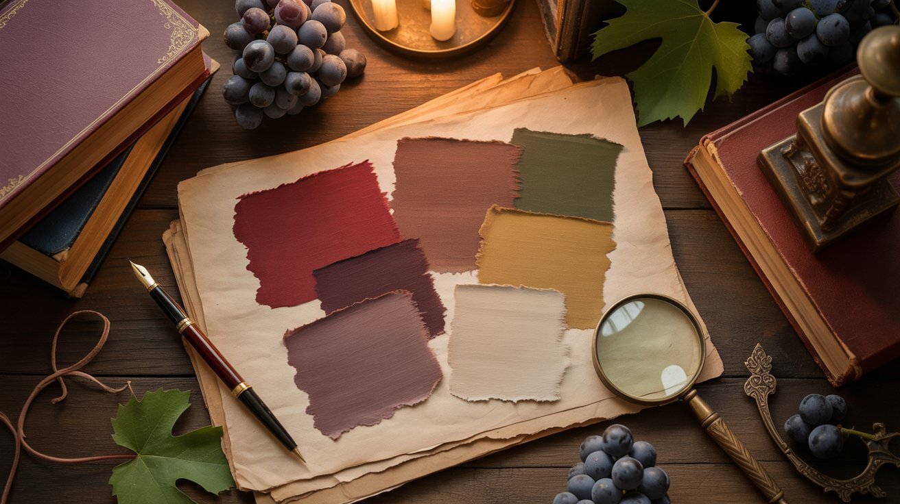
Muted maroon, mossy green, and terracotta for an aged, wine-cellar feel.
These colors together feel like a cool evening in an old stone cellar. They work well for moody editorial photography or dark home accents.
Hex Codes: #5C464B, #324C47, #331F15, #906642, #F0CBAD
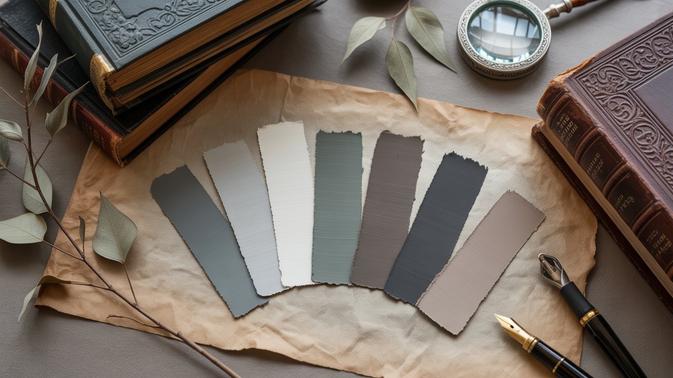
13. Misty Moor Palette
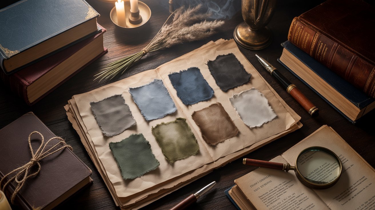
Foggy slate, earthy charcoal, and soft beige for a cool, calm look.
This palette leans cooler than most. It is great for a minimalist dark academia room or as a fashion neutral base for layered outfits.
Hex Codes: #637371, #26261C, #8C7251, #D9B991, #593825
14. Cozy Hearth Palette
Chocolate, mahogany, and midnight black tones for a warm and dark feel.
This is a very deep and moody palette. Use it as a base in room design with small pops of warmer accent tones to keep the space from feeling too heavy.
Hex Codes: #2B1B16, #26261C, #7A6F5E, #4D2F32, #0D0D0D
15. Autumnal Sunset Palette
Burgundy, teal, olive, and warm copper for a rich and layered seasonal look.
The mix of cool teal and warm copper makes this palette feel dynamic. It works well in art projects or as a fashion color story for fall and winter.
Hex Codes: #733C4A, #253D40, #627369, #0D0D0C, #A67041
16. Silver Birch Palette
Pale silver, earthy olive, and driftwood gray for a cool, understated base.
This is a lighter dark academia palette. Use it when you want a muted look that still carries the moody, vintage quality of the style.
Hex Codes: #D2D8D9, #73694C, #59514D, #261D1B, #0D0C0C
17. Scholarly Library Palette
Antique parchment, mahogany, and rich leather tones for a bookish feel.
This palette feels like the inside of an old university library. The warm parchment and deep mahogany are a natural pairing for interiors and print branding.
Hex Codes: #A69886, #8C5637, #734C36, #59382C, #261714
18. Quiet Wisdom Palette
Subdued slate, ivy green, and aged brass for a calm and scholarly look.
This palette has a very calm energy. The slate and ivy green feel grounded, while the aged brass adds just enough warmth to keep it from going cold.
Hex Codes: #AAB5BF, #618C88, #2F5952, #0D0B08, #594636
19. Rustic Scholar Palette
Deep forest green, amber glow, and burnished copper for a warm and rich mix.
These three tones together feel like a scholar’s desk lit by candlelight. The green base grounds the warm amber and copper accents in a very natural way.
Hex Codes: #1D402F, #9FA69C, #F2A03D, #D97C2B, #732A10
20. Tranquil Waters Palette
Misty blues, ocean depths, and rich mahogany for a cool contrast with warmth.
This palette is one of the more water-toned options in the list. The blues add a cool depth while the mahogany keeps it warm and grounded at the same time.
Hex Codes: #C7D2D9, #172623, #225945, #BF8C60, #733924
21. Coffee & Cocoa Palette
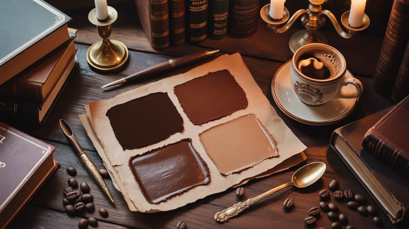
Warm coffee, cocoa, and cream shades for the coziest dark academia feel.
This palette feels like a warm mug on a cold day. It is one of the most approachable in the list and works well across fashion, interiors, and branding projects.
Hex Codes: #4B3621, #A67B5B, #D9B191, #261914, #59392E
Tips for Using Dark Academia Color Palettes
Simple, practical ways to mix, layer, and apply these shades in any project.
- Start with a neutral base like dark charcoal, warm cream, or deep brown, then layer accent colors on top.
- Stick to three or four shades per project to keep the moody, cohesive quality intact.
- In interiors, pick one dominant color, one secondary color, and one accent to avoid visual heaviness.
- For fashion, layer textures within the same color family for a natural, classic look.
- For digital work, paste hex codes directly into tools like Canva, Figma, or Adobe for exact color matching.
Conclusion
I personally love how the dark academia color palette brings a sense of calm and quiet history to any space or project.
There is something very grounding about working with these deep, warm, earthy tones. They never feel overdone.
I hope this guide gave you a solid starting point. Pick one palette that speaks to you and try it somewhere small first. A mood board or a quick digital mockup is a great place to begin.
If you found this helpful, share it with a friend or drop a comment below. I would love to hear which palette you chose!
Frequently Asked Questions
What is a dark academia color palette?
It is a set of moody, vintage-style shades like burgundy, deep brown, and charcoal that reflect the dark academia style.
How do I use dark academia color palettes in interior design?
Pick one dark anchor color and build around it using warmer accents, rich wood tones, and layered lighting.
Can I create my own dark academia color palette?
Yes, choose three to five earthy or moody shades starting with a deep base, a mid tone, and one warm accent.
What are the best brands for dark academia colors?
Sherwin Williams and Benjamin Moore both carry deep neutrals and earthy paint shades that match this style well.
How to convert hex codes to RGB for digital projects?
Paste the hex code into any free online converter or directly into design tools like Canva, Figma, or Photoshop.